• WORK
  • ABOUT
  • INSTAGRAM
Broadsheet Design
  • WORK
  • ABOUT
  • INSTAGRAM

THE RARE WEDDING INVITATION...

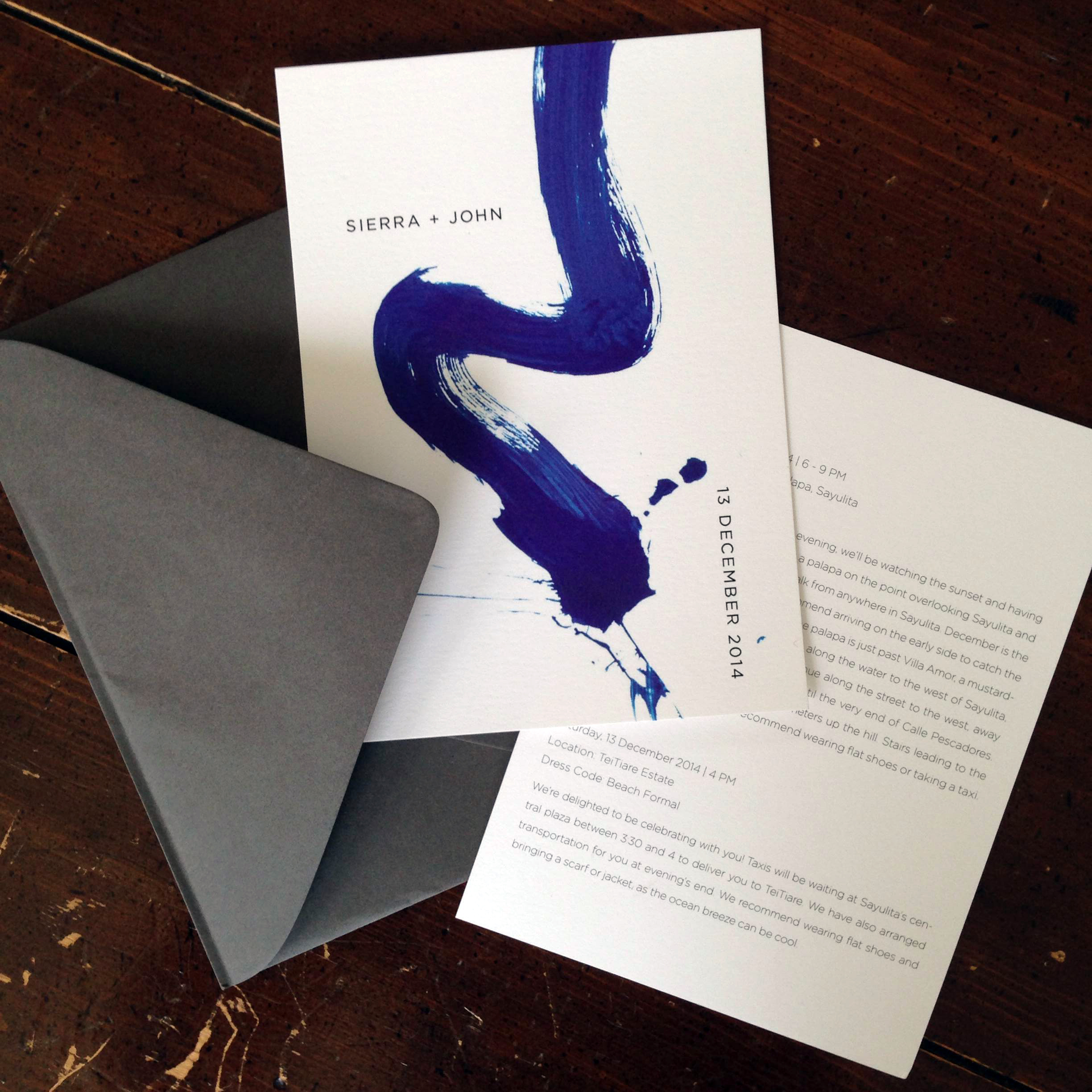
Don't get me wrong – I loooove love. All about it. But wedding invitation design? THAT is something I reserve for the very best of friends, with bonus points for a bride with spectacular taste that promises a beautiful and inspiring outcome. That's definitely the category that my dear friend Sierra falls into – smart as a whip, French-speaking, red lipstick wearing, perpetually elegant (usually in black, ideally in Céline), mile-a-minute, with a smile that will just about knock you over and a big heart to go with it. So when she asked for help with invitations for her upcoming wedding, I was all over it. We had fun with paint flourishes and hand-drawn maps, and the big questions of military time v. the twelve-hour clock and who doesn't like their middle name. Tra-la!

I was out of town when the invitations went to print, and the cobalt blue proved tricky, so Sierra, in classic "let's roll up our sleeves and get this done" fashion, trucked right down to the printer's to sit with the color tech and get it right. She then proceeded to set up a shop in a conference room to stuff envelopes and get these (slightly tardy) babies on their way. Did I mention how awesome she is? Now she has a one-of-a-kind wedding invitation to match.

Thursday 10.30.14
Posted by Laine Carlsness
Comments: 1
 

FEATHERING THE NEST

I recently had the pleasure of creating a logo for Nest and Burrow, the e-commerce branch of Nest Design Co., the lovely and livable Marin-based interior design firm run by Heather Brock and Jennifer Patton Wundrow. Being designers themselves, they had a very clear idea of their brand inspiration and gave me some seriously phenomenal mood boards to work from. I kind of want to live in those mood boards – check out their site – I think you'll agree.

The logo is simple, chic, and reserved with a unique, modern twist. It plays nicely with their sophisticated and colorful product lines, and the single "monogram" version of the logo gives them great flexibility to create branded items without overplaying their name. I can't wait to see the savvy fashion-forward ladies of Nest and Burrow take what we created and run with it!

categories: identity, on the clock
Thursday 10.09.14
Posted by Laine Carlsness
 

CHAIN CHAIN CHAIN AT THE STARTING GATE...

Awhile back, I was contacted by a dear former co-worker who was starting up a bike touring company in Marin. Sara was in need of an identity for her fledgling company, and I was thrilled to help – her enthusiasm, humor, and irreverence make her a total gas to work with, then and now. Together we dreamed up an identity that suited her quirk and wit, and applied it to business cards (soon to come) and a tri-fold brochure in a fun, compact size.

Chock-full of information about her amazing tours in Marin County and original photography by Sara herself, it was so fun and satisfying to put together. Brochures scratch a data-organization itch that branding and identity just do not – and to know me is to know how much I loooove to put things away in their cubbies...

I can't wait to see Sara kill it on the two-wheeled scene – we're working on her site, but if you've got any questions for her in the meantime, she's at sara@chainbiketours.com.

Enjoy the photos, and big thanks as always to Edwin at Essence Printing for taking my work from digital to terrestrial. What would I do without you?! 

IMG_2309.JPG
categories: on the clock, identity
Tuesday 08.19.14
Posted by Laine Carlsness
 
Newer / Older
squarespace expert_white.png