• WORK
  • ABOUT
  • INSTAGRAM
Broadsheet Design
  • WORK
  • ABOUT
  • INSTAGRAM

MORE TALES OF INK AND TYPE

lp11.jpg
lp9.jpg
lp8.jpg

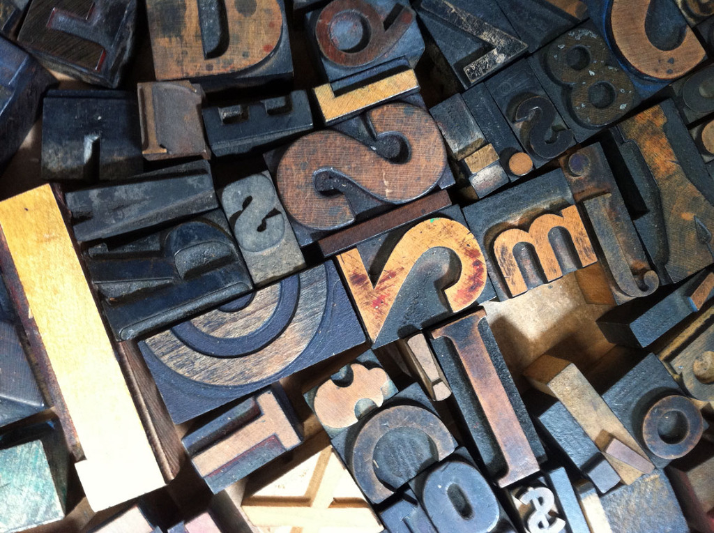
I've completed my third of four letterpress classes and am so much happier with the results of this go-round. I'm learning that simplicity is best to start, reminding me that it's best to know the rules before you go ahead and start breaking them. With that in mind, I reset last week's paragraph project with simpler type. I won't show you the original, but take my word for it, this is much better.

My next project was a card, and (shocker) I went with the "thank you" variety. Mama raised me right. And I can't lie – I may have missed (or just found) my calling as a thank you card copywriter, because once I got started doodling ideas I was a veritable runaway train of gratitude.

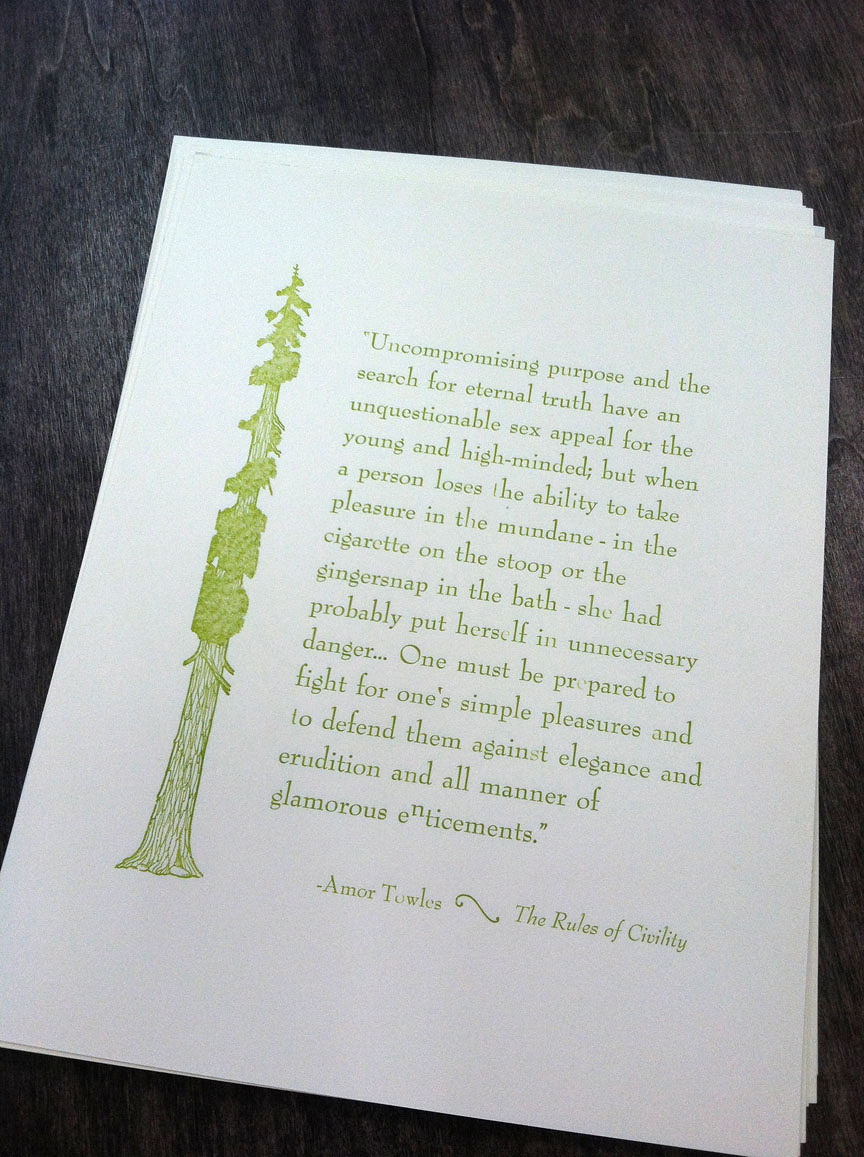
I'm so pleased with how it turned out. I also I love that a letterpress dingbat/illustration is totally acceptable (retro, adorable!) in a way that clip art will never be. It's so fun to open all the drawers and search for just the perfect thing – there are so many delicious options.

Do something nice for me and I'll send one your way! 

PS. Did you know that the ampersand comes from the French "et"? In some of its forms, you can still see how the "e" is crossed with a "t" to make the shape. A little cocktail party conversation for ya. 

Tuesday 08.27.13
Posted by Laine Carlsness
 

MY LATEST SQUEEZE...

jg1.jpg
jg2.jpg

Meet Juice Girl – a brand-spanking new company run by two friends and setting up shop this fall in Mill Valley. Up until my chats with Caroline and Melora, my juice knowledge could fit in one of those wheat grass shot glasses. Turns out that they're fans of cold-pressed juice, which keeps the ingredients cold, which means more nutrients, which means you live forever (ok, I made that last part up). But this stuff is good for you, people. There's kale in there.

What I loved about Caroline and Melora's take on juicing was how down to earth it was. In a sea of slick competitors that can be a little intimidating to the newbie, they wanted their brand to be approachable, fun, kid and family friendly, and playful. And apparently when you say "playful", I think vegetables with capes. Naturally. We ended up with two marks – one for their main brand and Ms. Carrot for their kid's line. 

They're going to be selling their super-fresh, locally-made bottles of awesomesauce at Yolo in Mill Valley starting September 1. Check them out if you're in the neighborhood!

Friday 08.23.13
Posted by Laine Carlsness
 

VANDERCOOKERY

lp2.JPG
lp3.JPG
lp5.jpg
lp1.jpg
lp4.jpg
lp7.jpg

Today was the first day of my month-long Vandercook letterpress class at the San Francisco Center for the Book – and it was a success – though I'm beyond exhausted. How can this be more tiring than chasing after toddlers? I have no idea.

It's a super small class, just four of us, which is pretty amazing. I'm the only woman, which suprised me, and the only designer, which suprised me more. All in all a really good group – I'm especially impressed by the engineer learning letterpress. You're awesome, dude. Today we learned how to set type (upside-down, backwards, oh my lord) and proof it, then get it on press, lock it up, ink it, run it, clean it, then collapse in a sweaty pile. Repeat for additional color runs (overprinting has got me all hot under the collar – can't wait!). 

I love all of the common phrases that come from the physical realities of the letterpress shop – "mind your p's and q's" (they look the same upside-down and backwards, tricky), "uppercase, lowercase" (from where at the type setting bench those letters are located), "leading" (made of actual lead, please to wash hands before eating) and "type lockup" (type that is literally locked up together in the galley tray).

The center has an awesome collection of specimens, from typefaces and etchings to wood carvings, old maps, advertising dingbats, decorated capitals, you name it. I even found an old Olympic Club logo! I'm looking forward to digging in, messing up and learning more.

It feels so wonderful to get out of the digital realm for a bit and do something real with my hands – to envision a design, create it, ink it and run it all on my own, no computers or vendors required. I'm looking forward to personal projects and perhaps the odd wedding invitation in my future. But only for awesome brides. You know who you are, ladies.

See below for a few photos I snapped of the SFCB goodies, and our very first silly project. I'm thinking of typesetting some Shel Silverstein for my next one...

Sunday 08.11.13
Posted by Laine Carlsness
 
Newer / Older
squarespace expert_white.png