• WORK
  • ABOUT
  • INSTAGRAM
Broadsheet Design
  • WORK
  • ABOUT
  • INSTAGRAM

ANOTHER WOMAN-POWERED BUSINESS LAUNCH!

I'm proud to say that my niche as a designer has become female-owned small (to start!) businesses. Like myself, so many women find that having a family and working for someone else just... don't mix. Chantal is one such client, now setting out on her own in the world of executive coaching. We worked together to narrow down her list of name options to one (great) name, and away we went from there! Her brand is clean and professional with a bit of an edge to help her stand out from the crowd of competitors, which tend to lean either super corporate, or a little "woo woo", if you know what I mean.

The site is simple and functional, focusing on her philosophy and fantastic testimonials. I used a new Squarespace template for this one, Hatch, and just loved it. Very flexible, with expansive design options and elegant bones.

And she's off to to the races!

Friday 04.28.17
Posted by Laine Carlsness
 

A (LONG OVERDUE) PORTFOLIO UPDATE...

I got a quiet moment and thought I'd update my portfolio, only to realize that I hadn't done it in far too long. Eek! I wonder how outdated my invoicing is... but that's a thought for another day. 

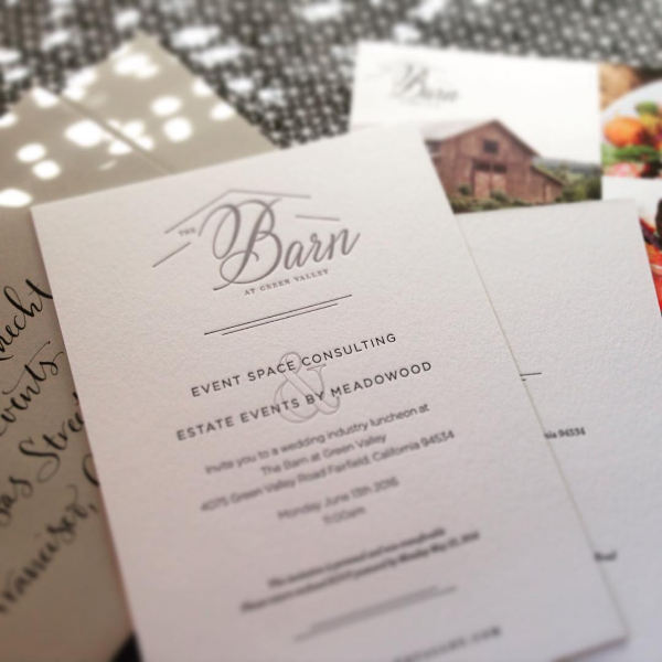
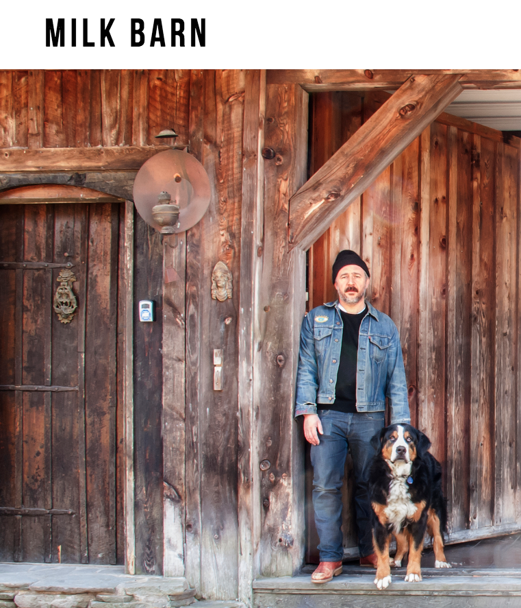
It was wonderful to page through the work and feel gratitude for the amazing clients I've been able to work with, and pride in the designs we came up with together. Here are a few highlights!

Screen Shot 2016-12-21 at 12.56.25 PM.png
this is home logo_no square.jpg
Screen Shot 2016-12-21 at 1.12.40 PM.png
IMG_0438 (1)_thumb.jpg
Wednesday 12.21.16
Posted by Laine Carlsness
 

BEST COAST LOVE

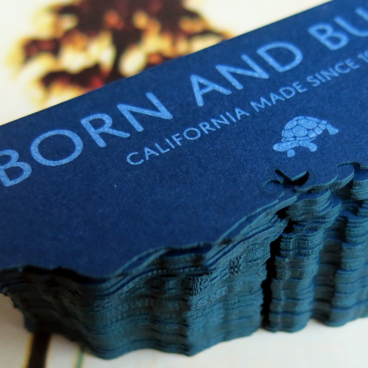
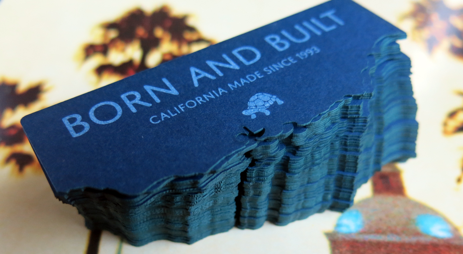
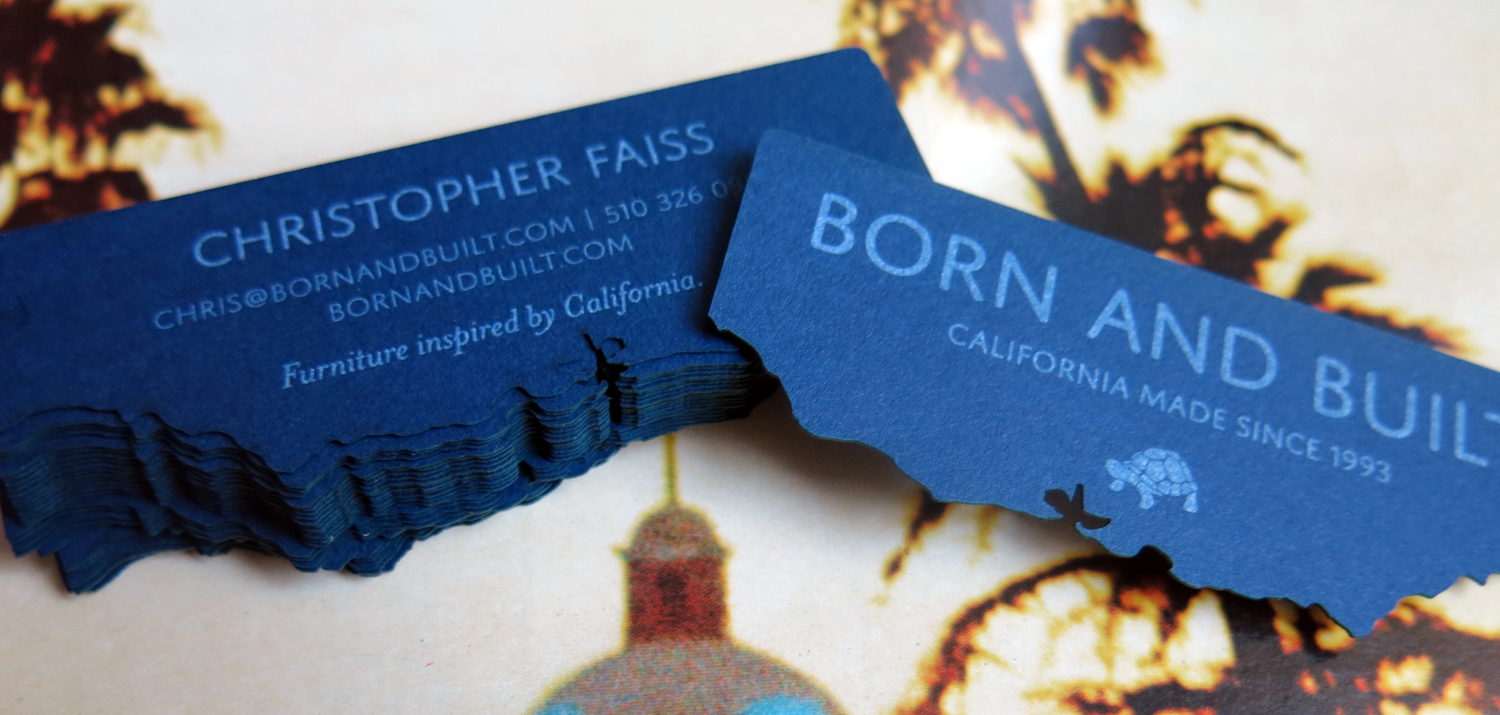
I'm long overdue to post about these beauties. These business cards miiiiiight just be my favorite thing. They were inspired by a truly inspired client and friend, Chris, and his incredibly chic partner in life and business, Airen. They truly are a dynamic duo who were open to new ideas but clear about what they wanted – a California-forward brand that would catch the eye of retail furniture shop owners, and a card that you'd want to hang onto just for the sheer coolness of it.

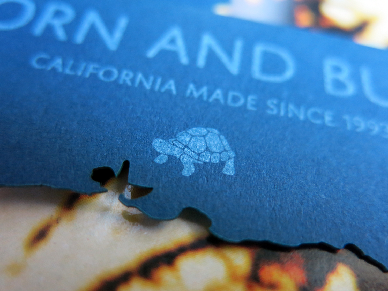
The brand mark is simple and clean with approachable, rounded edges and room to breath. The tortoise is a nod to Chris's love of form that follows function, personified by the gorgeous forms of a tortoise's (very functional) shell. 

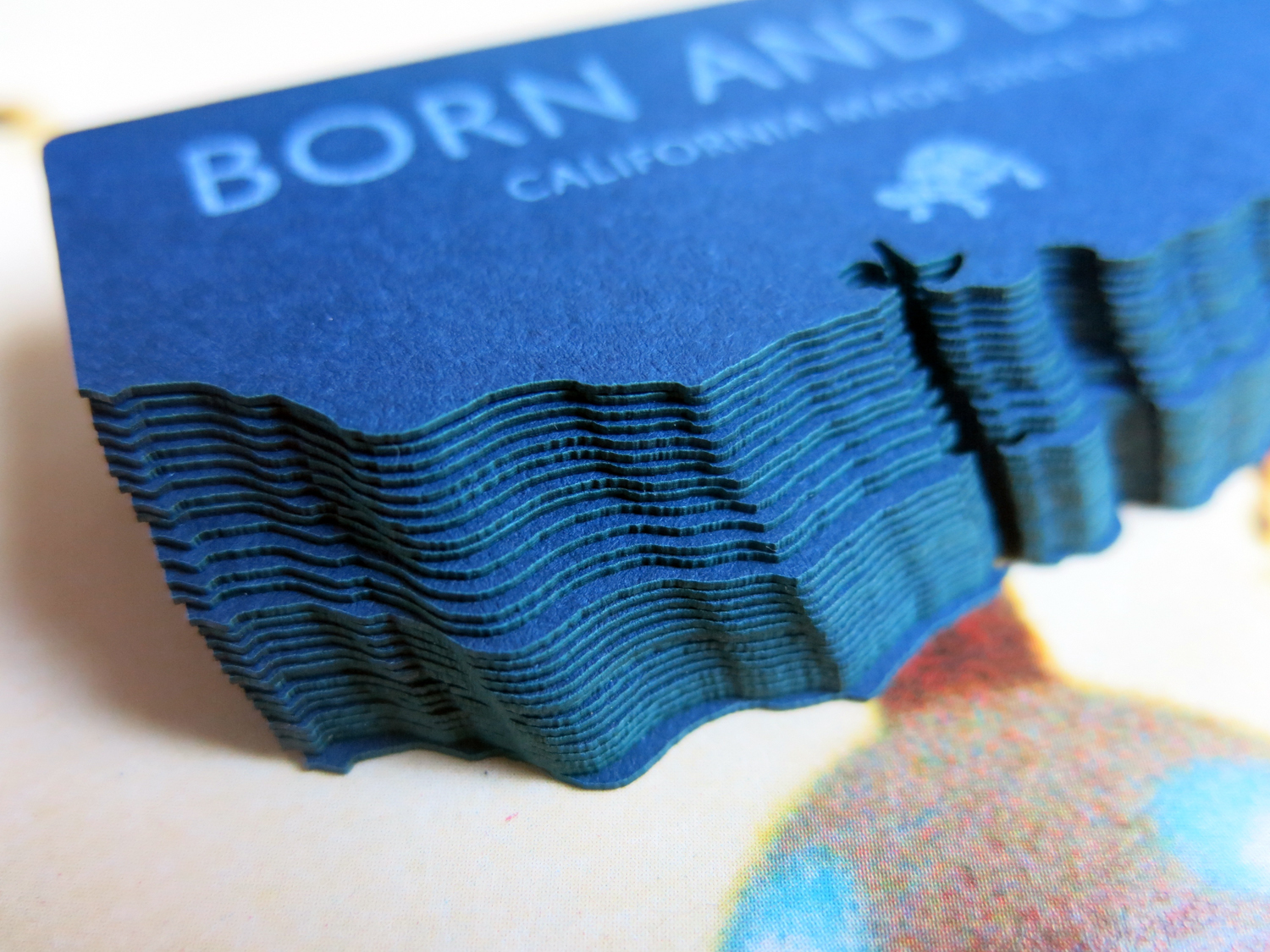
The card was a labor of love, from the tracing of the California coastline (complete with Bay Area detail, naturally), to the paper (Neenah 130# cover in Patriot Blue), to the printing (white ink only, thank you Truman at Image Printing) to the custom laser cut edges (die-cuts need not apply for an edge this intricate). The laser cutting was an amazing process, headed up handily by Alex at Pagoda Arts. I love the way it turned the thick edge of the navy paper an oceanic kelp green. I love the beautiful surprises inherent in making something with paper and skilled hands.

I'll share more about my new favorite collaboration as it comes!

IMG_0438 (1).jpg
IMG_0444 (1).jpg
IMG_0442.jpg
IMG_0452.jpg
Wednesday 09.14.16
Posted by Laine Carlsness
 
Newer / Older
squarespace expert_white.png